

With the right label, you give your product a face and
create an emotional bond with the buyer.
A good label is based on the right substrate and
the colours and finishes that can be combined with it.
Attention must be paid to the right texture, the right adhesive
and the optimum printing system for the subsequent area of
application. We take several aspects into account when making
joint material decisions, such as product type and utilisation.
We design and produce self-adhesive labels to the highest
quality standards with years of experience in the food and
beverage segment.
CCL's in-house graphics and design workshop will work with you
to develop a design that meets your requirements or one that
you would never have thought of yourself.
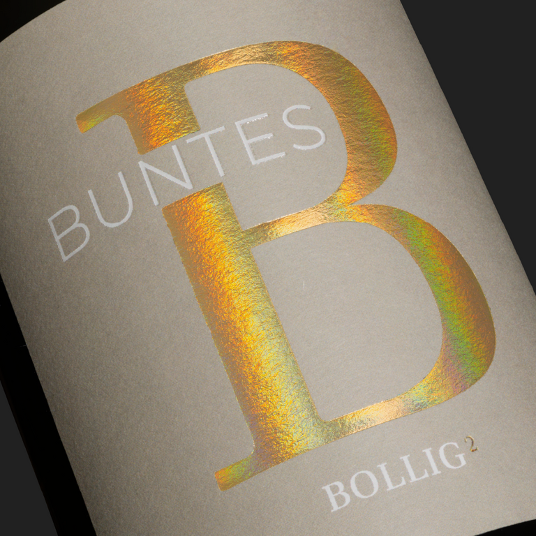
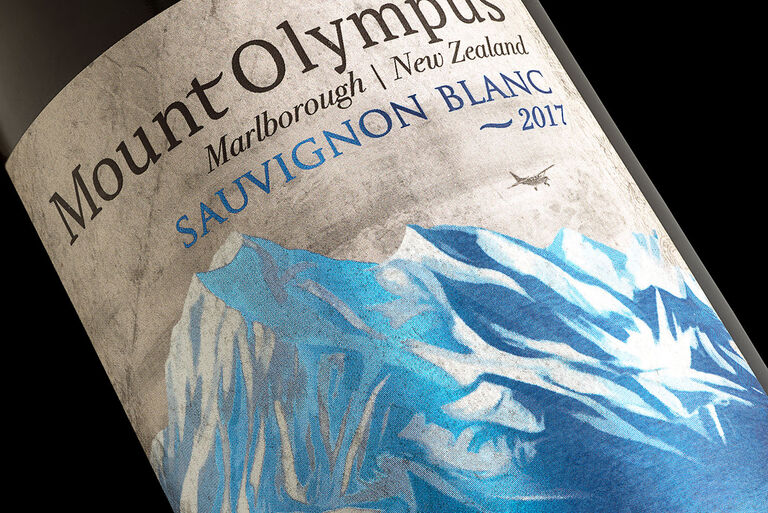
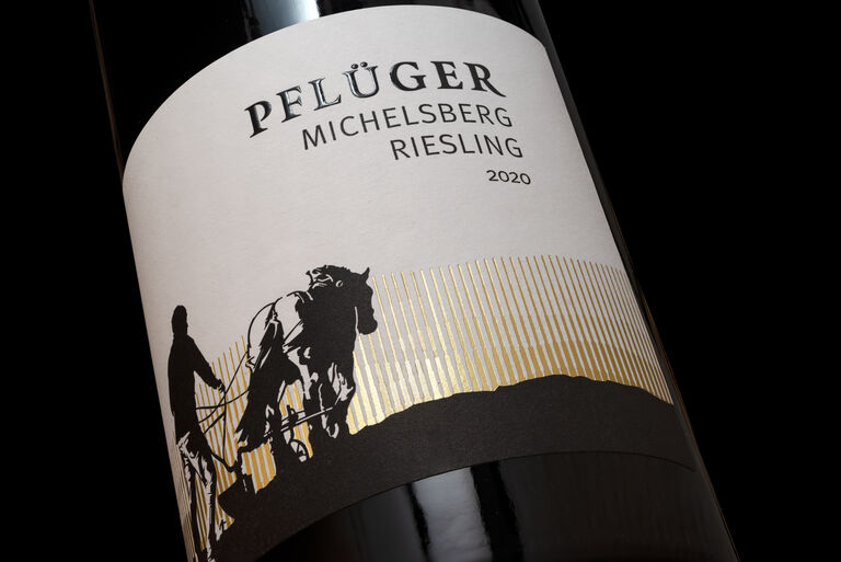
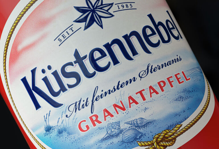
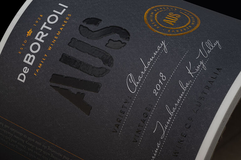
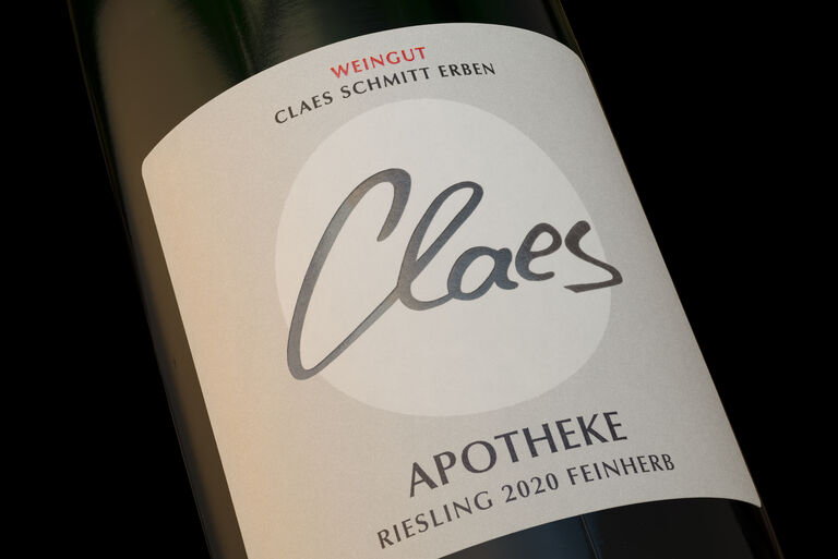
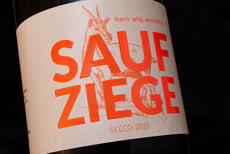
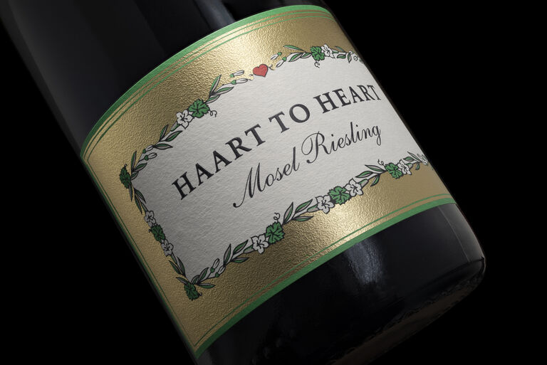
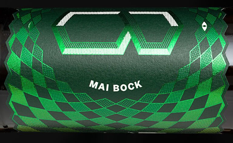
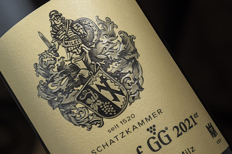
In our gallery you can get a first impression of the many possibilities for your label design.
We bring your label to life
State-of-the-art technologies enable us to optimise the printing of your label. A large portfolio of high-quality papers and films in combination with offset, flexo or digital printing as well as all kinds of finishes bring your label to life.
We also offer an imprint service and labels with the DPG deposit logo. We have developed a helpful guide for anyone who is getting to grips with the DPG for the first time.
Our consultants Holger Wenzel and Alexander Gasper will be happy to answer any questions you may have.
Contact us - we will be happy to advise you.
With the label of the month, we want to honour a particularly
beautiful label from our customers every month
and thank them for their great cooperation.
What happens when opposites collide?
When power meets elegance. Structure meets finesse.
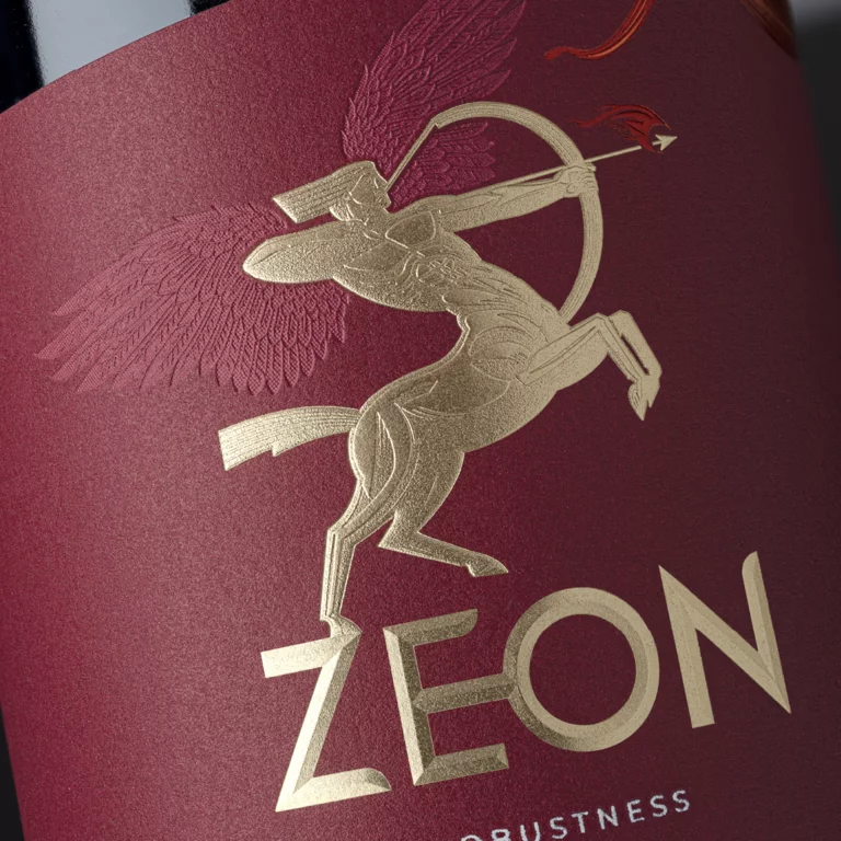
In collaboration with Atelier Design and designer Luca
Morandini, ‘Zeon’ was created – a showcase label that doesn’t
simply adorn a wine bottle, but tells a whole story.
The inspiration: the centaur.
A mythological figure, half horse, half human — powerful and wild, yet precise and elegant. For Luca Morandini, this very figure became the symbol of the imaginary cuvée ‘Zeon’: a union of two completely different grape varieties into a new whole.
And it is precisely this tension that Atelier Design has translated into a label that is not just meant to be looked at, but experienced.
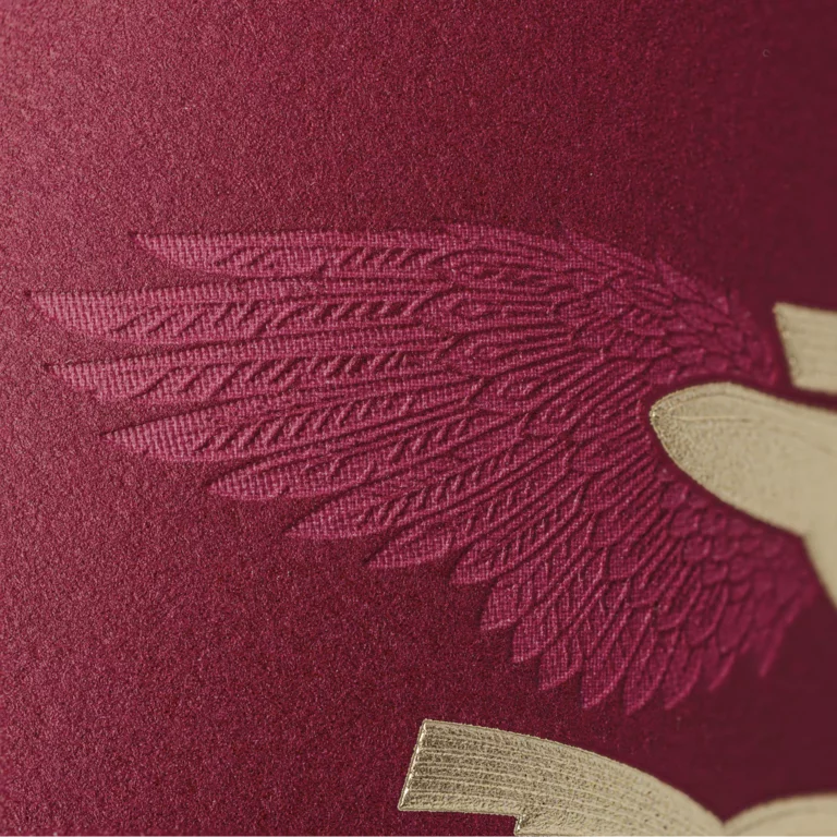
At the centre is the gold-embossed centaur, rendered with the finest relief and textured embossing that captures light and movement. The centaur’s wings add an extra dimension — in precise debossing that reveals every single feather.
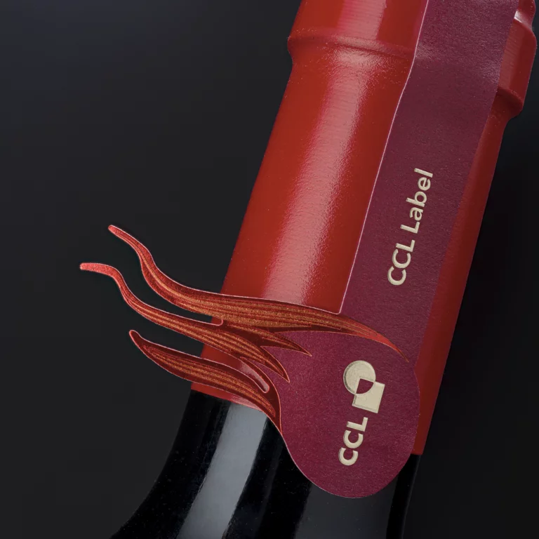
The flames surrounding the figure symbolise the transformative power of passion — that ‘fire’ from which something new is born. Multi-layered hot foils in iridescent shades of red and orange lend them depth and dynamism.
Another distinctive feature: the flames on the neck label are
deliberately raised from the bottle, creating an almost
lifelike impression.
Yet it is precisely such designs that demonstrate that
extraordinary ideas require extraordinary craftsmanship.
After all, a label like this thrives on precision. On the feel of the material. On printers who understand every detail and can reproduce it with technical precision.
It is only through this interplay of creative vision and skilled craftsmanship that the impact which ultimately defines a label like ‘Zeon’ is achieved.
Would you also like to discover the labels of the past
months?
Then visit us on our social media channels.